Thursday, March 27, 2014

Personal work: What Real Wolves


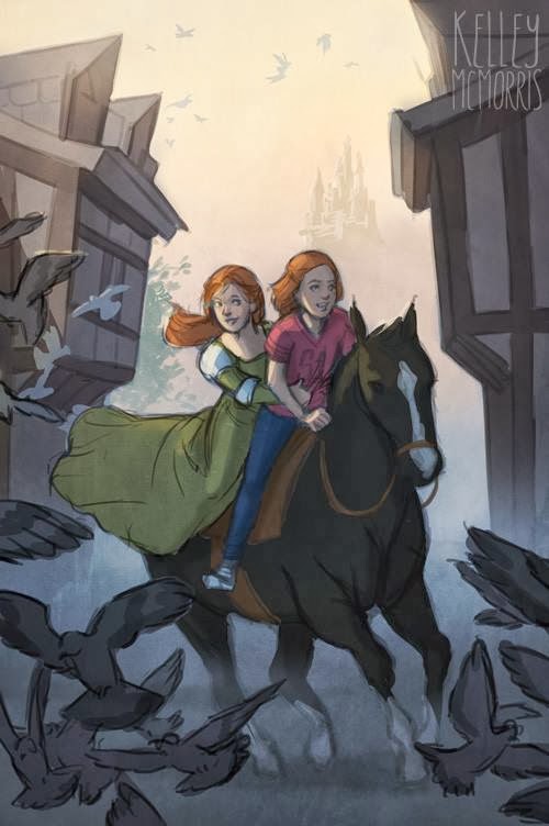
Ok, I can already feel my parents getting nervous over this one, so let me just say: this is not autobiographical.

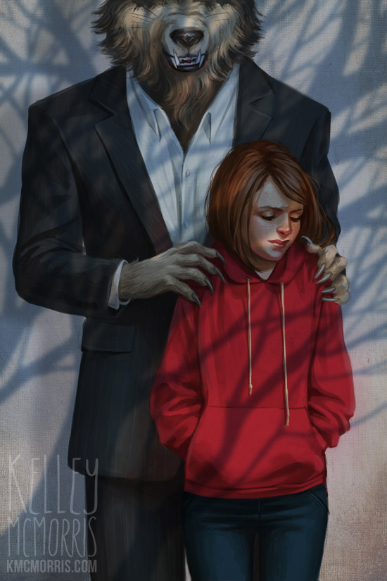
It seems to me that there's some unspoken rule that every illustrator must have at least one Little Red Riding Hood drawing. So here's mine. I tried to get away from the cliche depictions of LRRH, although I'm sure I'm not the first to put her in a hoodie.

This is just one of those compositions that popped into my head and I got started before I could talk myself out of it. I drew exactly three thumbnails.


Three. Don't be like me, kids. Draw more thumbnails. Next I took a quick photo reference.


Sadly I completely forgot to take any in-progress shots of this illustration. Here's the almost-finished version I had yesterday:


I really struggled with drawing the wolf's claws, because wolf paws on their own don't really look menacing. So I looked at drawings of werewolves and rat paws. (gross)


At this point, it occurred to me, "does this wolf in a suit look silly instead of sinister?" Nervous, I posted the piece on Deviantart, asking for opinions. I quickly received some insightful comments. People suggested increasing the dimpling of the sweatshirt fabric underneath the claws, to make it look more like he was gripping her. Also, to make the wolf a lot more beefy looking, to lower his head and lengthen his muzzle, "so that it looks more like a beast is wearing the suit and less like a wolf head placed on top of a man's body."


In other words: the painting was strong in my strong areas (drawing girls) but weak in my weak areas (drawing scary things). 

Sometimes I know that, but I still need someone to point it out to me.

Monday, March 24, 2014

My New Workspace - and interview at Illustrious


My husband and I moved into our new apartment over one month ago. At the time, we were sharing a large desk, but he and I were distracting each other too much.

Him: Look at this new game trailer!
Me: You're interrupting me.
(2 minutes later)
Me: Look at this cute hedgehog!

Last week I decided that I really needed my own quiet corner. I bought a little white table from IKEA and set up my office in a corner of our bedroom. I can use it as a standing desk, and when my legs get tired I use the stool for a while.


I put some pretty photos and artwork on the wall. My new workspace not exactly Pinterest material, but it's quiet and cozy. I think I'd like to hang a cute lamp from the ceiling.

In other news, I was recently interviewed at Alex Hurst's blog Illustrious. It was a fun interview to do! You can read it here.

Thursday, March 20, 2014

The Key to Fantasy Art

"Don’t think that breasts alone will sell your portfolio. Believe me, Wizards of the Coast gets dozens of portfolios every week from aspiring fantasy artists. It seems that the amount of cleavage is in reverse proportion to talent. The keys to success in fantasy gaming art are action– observe how things move and balance; story; and believability. They want to see good art, not great bodies."
- Todd Lockwood 

Wednesday, March 19, 2014

Pencil portrait - The Radiant Bride


Here's a custom pencil portrait I recently completed for an Etsy customer, who ordered it for her anniversary. While working on this portrait, whenever I was drawing the bride's face I couldn't help but smile. She just looks really, really happy, like she's glowing from the inside out.


You may notice that I made the bride ever so slightly taller in the portrait. This was to try and lessen the empty space between her and the groom, so their heads would be a little closer together in the portrait.


I like the bokeh effect in the background.

Monday, March 17, 2014

Depicting Good and Evil

 illustration by Cory Godbey
"Playing it safe in fantasy art means macabre, violent and, at times, terribly sexist imagery. To me, it's just lazy and uncreative. The struggle between good and evil never ceases to be exciting. But when the grotesque is glorified and beauty is seen as childish or weak, then we've taken a serious misstep."

- Cory Godbey

"Oh, how beneficial it would be for mankind if all the arts...set themselves a common goal and joined hands with the laws to make us love virtue and hate vice! It is up to the philosopher to...address himself to the poet, the painter, the musician, and to cry out to them in a loud voice: Men of genius, why has heaven endowed you?"

-Denis Diderot, 16th century philosopher and art critic

Thursday, March 13, 2014

Personal work? Maybe.


One of my biggest fears in pursuing a professional art career was that it would suck the fun out of drawing. Thankfully, this hasn't happened. However, I have found that it's more difficult to create personal work.

Before starting a personal piece, I get stuck on a dozen questions. Is this too similar to something in my portfolio already? Is this filling any gaps in my portfolio? Is this something I would like to draw again? Would this fit on a promotional postcard? Is it dynamic enough? Is it dramatic enough? Is it too comfortable? Should I make it a wraparound? Should I do something fun or take on a new challenge?

As a result, I've found it difficult to start - and finish - personal work lately. When I'm left to my own devices, totally free to draw whatever I want, nothing seems fresh or original enough.

The drawing above is an unfinished personal piece I can't decide whether to complete. I definitely gave myself a huge challenge here: horse, a ton of birds, morning light, and - my archnemesis - buildings. I guess I'm not making things easier on myself, am I?

Monday, March 10, 2014

Book Covers Before and After Text

The cool thing about book covers is that they're made to work together with text, but they also stand on their own. I find it really interesting to see what book cover illustrations look like both with and without text. Here are some great examples from some insanely talented illustrators.


Illustrated by David Wyatt


Illustrated by Kevin Keele


Illustrated by Jason Chan


Illustrated by Sam Weber


Illustrated by Jon Foster


Illustrated by Tyler Jacobson


Illustrated by Jason Chan

Thursday, March 6, 2014

Personal work: Zaya the Unfinished


Here is a piece I started last year but never finished. It's an earlier version of a character I named Zaya, who later appeared in this illustration, "Zaya and the Northern Lights."


In the unfinished illustration, she has a more Tibetan look. I abandoned this piece because I felt it was too static and posed, and I felt like I should do something with more movement.


I still really like the colors, though.

Monday, March 3, 2014

Beatrix Potter and illustrating rabbits


Beatrix Potter and her bunny, Benjamin Bouncer, 1891.


I don't remember whether I was a fan of Peter Rabbit growing up. However, in my early teens my family adopted some rabbits and I spent many, many hours just observing them. Ugly, cartoony, anthropomorphic rabbit drawings became my pet peeve. Some time later, I noticed some illustrations by Beatrix Potter and thought to myself, "she really understands rabbits." A kindred spirit.


Beatrix Potter's animal characters are extremely realistic, but still cute and expressive. I respect her work a lot.


Related Posts Plugin for WordPress, Blogger...