Monday, October 4, 2021

Saint and Sinner

Prints Available: Saint print, Sinner print, both images together

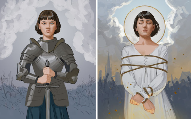
If there's one thing I like, it's cool warrior women, historical or otherwise. I've always wanted to draw Joan of Arc, and I have several unfinished drawings of her that go back years. I was never able to finish them because I felt they were cliché and uninspired. What I could bring to Joan of Arc imagery that hadn't been done before?

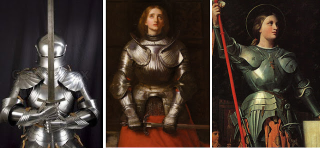
Recently I purchased some of Howard Lyon's reference packs, just because they looked cool, and found this gem of a reference photo:

That's a good Joan, I thought. Although I didn't know exactly where I was going with this, the ideas started coming as I drew.

For the past few years I've been thinking a lot about the intersection of faith and politics, and how people sometimes change their religious beliefs depending on what's politically advantageous.

Joan of Arc didn't change what she believed or how she behaved. She simply was who she was. Whether she was being labeled a miracle, heretic or a martyr, all depended on who was in power at the time and what they needed to believe about her.

Finally I had a concept that felt meaningful to me. I developed the idea of a diptych titled Saint and Sinner. (Not to be confused with my favorite ice cream shop, Salt & Straw.) The compositions would contrast Joan's consistency and conviction with the changing environment around her. I found another photo in the reference pack of the model with her face slightly upturned, so now I had two photos of the same model. 

For the "Saint" picture, I collected pictures of suits of armor in similar lighting situations. (I didn't want to spend a ton of time digging into the particulars of historical armor, but the very brief research I did indicated that Joan's armor should be simple.)

For the "Sinner" picture, I took my own reference photos for the body and hands, using a lamp on the floor and a jump rope.

With all these reference photos assembled, I started putting the drawings together.

While I was excited about this direction, and excited to be producing my first personal pieces since January (yikes), I still felt like something was missing. I sent the WIPs to my friend Anna Inkyung Lee, a concept artist. She was the one who suggested adding the directional elements in the form of flags and halberds, which greatly strengthened the compositions. Thank you, Anna!

Having good reference photos can make a drawing so much easier. I highly recommend Howard Lyon's reference packs on Gumroad. They're absolutely worth the money.

If you've never read about Joan of Arc, I'd recommend checking her out, even if it's just going through her Wikipedia page for a while. For example, did you know that you can read the complete transcripts of her trial? And that she was executed for heresy and for wearing men's clothing?


The world is full of people who say one thing, yet do another. Joan was consistent in her conviction, to the very end. That's why we remember her, while the men who prosecuted her, assaulted her, or turned a blind eye to her situation, are footnotes in history.

Anyway this is veering dangerously close to an artist statement, and I'm scared of those, so bye.

bye

Thursday, March 4, 2021

What Does Well on Social Media


This drawing went viral on Twitter last year.


That doesn't usually happen to me. Despite making a living as a professional illustrator for seven years now, most of the art I post online get maybe 40 "likes" on Facebook or Twitter before disappearing into the internet abyss. 

But over the years, I have had a few pieces go viral.

Here's one, a fanart of Hamilton from 2016, which has over a thousand "notes" on Tumblr. (Is that a lot? I dunno, it felt like a lot to me!)

This image went viral as a meme on Facebook years and years ago, and it still pops up on my feed every once in a while. It's probably impossible to measure how many times it's been shared as a meme.


Finally, here's a comic I made that, as of this writing, has 17k likes on Twitter.


Do you want to know which of my drawings don't do well on social media?

*drumroll please*

***

***

***

BASICALLY EVERYTHING ELSE!!!

Check out the (lack of) engagement on these sweet, sweet posts:


So, what art does well on social media?

There can be lots of factors. But I think an important one is that the art resonates with people emotionally.

It's not about how technically good the drawing is. Sometimes the drawings that go viral are carefully rendered; sometimes they're just quick little doodles. 

This is why fanart tends to go viral: people have a strong emotional reaction to fanart because it brings up the emotions associated with a beloved character from the movie or book.

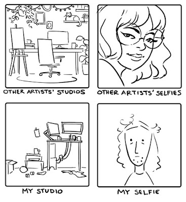
How about my self-portrait, then, the one of me writing at a desk? That one isn't fanart. Why did that go viral?

Back in The Great Before Time, when I did conventions, I was able to see people respond to this piece in person. I learned that, even though it's a drawing of me, people tend to see themselves in it - especially writers. They relate to the visual depiction of worldbuilding.

So what about my other drawings, the unpopular ones that never even broke 40 likes on Twitter? Are they bad because people don't respond to them emotionally?

No. Those pieces are meant to be used in the context of a client's project. They met the client's needs, but don't evoke an emotional response in the average person, especially out of context.

And that's fine. These are going nowhere on social media, but my clients were happy, I got paid, and hopefully kids are out there enjoying the books I've illustrated. Those are my goals. Some pats on the back on Twitter are much appreciated, but since that's not my goal, I don't get too upset when it doesn't happen. (I mean, do I whine about it sometimes? Sure! I'm only human!)

Ask yourself why social media popularity is important to you. It's fine to want attention and compliments; we all do! But know that online popularity isn't necessarily a ticket to riches and fame. And there are many art careers where it's not necessary at all.

So if you're struggling to find traction online: it doesn't mean that there's anything wrong with your art. Getting noticed might be a matter of luck and persistence, or it might be that your art just doesn't fit social media trends. The internet just likes certain things. The good news is that employers and publishers like other things, art galleries like other things, conventions and art fairs like other things. There's a place for your art. It may take some time and research to find it, but I believe that it's out there.

Don't let the silence on social media grind you down.

Monday, January 4, 2021

Dustin, the Scorched

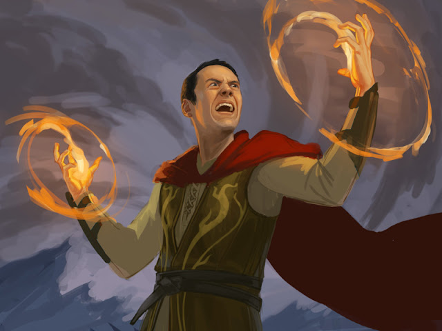
Lately I've been wanting to create some sample illustrations to submit to Wizards of the Coast. When Christmas rolled around, I was wondering what gift to give to my brother-in-law Dusty. He plays Magic the Gathering, and he's always been very supportive of my artwork. So I figured: two birds, one stone. Let's draw a Magic card for Dusty!

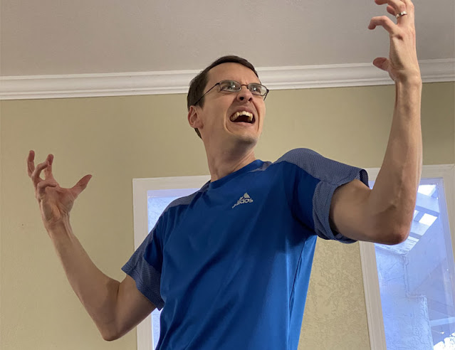
Dusty is...shall we say...not a shrinking violet. I knew right away that he needed to be a red fire mage. I also knew that, if the card was going to realistically look like Dusty, I was going to need to ask him to take some photo references. So the portrait wasn't going to be a surprise.

Still I think he was more than a little surprised when one morning I sent him this photo:

"Can you pose like this for me?" I said.

He certainly delivered.

The photo reference made the pose and expression easy, and I already settled a cool-toned background to contrast with the fire. But I had a surprisingly hard time coming up with an interesting outfit and character design. It went through a lot of iterations that were too Vanilla Fantasy.


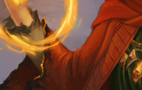
My husband came up with the idea of "The Scorched Mage," a fire caster whose spells are so powerful that his own sleeves are singed.


The glasses is an alternate version.


Finally, my husband designed a card for the art:


So there you go, my first Legendary Planeswalker. Merry Christmas Dusty!

Thursday, December 31, 2020

Goodbye 2020


These are almost all of the illustrations I completed in 2020. There are a few more I couldn't include because they're still under NDA. Looking at them all assembled like this is satisfying. It also makes me realize how much I tend to use the color purple.

*~*~ Superlatives ~*~*

Most Difficult


This frikkin mall scene from the Courtney book series from American Girl. This took FOREVER

Most Unusual

This paper doll, a promotional printable for the book Mexican Gothic from Del Rey Books. I'd never done a paper doll before, and I'm SO glad I got the chance!

Personal Favorite

I was so inspired by the book Mexican Gothic that I created this personal work. This turned out better than my expectations and feels like an artistic breakthrough for me

Most Viral

This stupid little comic that I drew in 5 minutes has, at time of writing, 17k likes on Twitter

~*~*~*~*~

I have a lot to be grateful for this year. Since both my husband and I were already working from home, the shutdown didn't directly affect our income. Illustration jobs were maybe a tad on the slow side this year but not by much. I checked off a bucket list item by getting to work with Penguin Random House on three different projects! I'm also grateful that, so far, all of my family members are healthy, and none of us lost our houses in the wildfires.

Sometimes people ask me, "How do you manage to work from home with kids?" or "How do you manage to create personal work on top of freelance work?" Or "how do you find a balance?"

Look, I don't know if I have anything special figured out. These drawings were created through a haze. The exhaustion that comes from herding small children all day, the sleep deprivation that comes from having a baby, the stress that the news pumped into my veins. Working at a hot computer while our air conditioner died during the height of summer. Working while wondering if my sore throat and headache were symptoms of covid or just smoke inhalation from the wildfires. I didn't blog much, and I didn't post a lot of art on social media. Most of the time, it was all I could do to meet my deadlines.

What I think I've learned from this year is to, hopefully, be less judgmental of others' productivity - especially based on what they post online. Because if 2020 taught me anything, it's that sometimes the people who seem the least productive are the ones working the hardest.

The people going slowest may be the ones with steeper hills to climb.

I used to tell people to work harder! Draw more! Post more on social media! UPDATE THAT PORTFOLIO! But I'm not interested in berating people for not working harder anymore.

Now I just say, do your best. Because that's hard enough.

And that's good enough.

Also: buy a nice espresso machine. You'll thank me.

Tuesday, August 25, 2020

Nowhere Boy cover


I don't always have a chance to read the books for which I illustrate covers. Usually it's a matter of time; the client wants me to get started right away and just gives me a brief synopsis of the book and whatever information I need to know. Sometimes they send me the manuscript to read on my own time, and sometimes they don't. Sometimes the book is still being written, and the client sends me just the first chapter to give me a feel for the story. This was a case where the client sent me the manuscript and I had the time to read it.

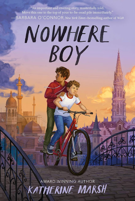
Nowhere Boy by Katherine Marsh is the story of an American boy living in Belgium who finds another boy, a Syrian refugee, living in his basement. The two boys, Max and Ahmed, bond over their shared feelings of being unwelcome outsiders, and together they develop a clever plan to get Ahmed into school.

I loved, loved, loved this book. It's equal parts fun and exciting heist, and a deeply touching story of friendship, family and loss. One particular chapter had me weeping out loud, which is not something I expected from a middle-grade book. I should know better than to underestimate middle-grade by now!

Anyway enough gushing. Let's talk about the process.

Nowhere Boy was originally published in 2018, but MacMillan wanted a fresh cover for this year's paperback re-release. The art director, Aurora Parlagreco, told me that she wanted something that expressed "hopeful friendship," and the idea of coming from two different worlds. She suggested a scene from the book where the two boys are riding a bike, with the skylines of Belgium and Aleppo in the background, but she also asked to see a few of my own ideas. Here are the sketches I sent.

I like them all, but I liked the bike one the best, and the AD agreed.

Next, it was time for color. In the book, this scene takes place at sunset, so I really leaned into those colors. Since the scene is already a little on the quiet side (no dragons, explosions or sparkly magic), I thought the colors needed to be really vibrant in order to keep things interesting.

The team asked for a few tweaks, mostly for me to darken Ahmed's skin tone, to darken the clouds behind him, and to make sure that the skylines in the background were clearly different cities. Then I was free to go to final.

BIKES ARE A LOT OF WORK TO DRAW.

PLEASE TAKE A MOMENT TO APPRECIATE THIS DRAWING OF A BIKE, AND LEAVE COMMENTS TELLING ME WHAT A GOOD JOB I DID THANK YOU

I especially like Ahmed looking back over his shoulder at Syria, the dark clouds seeming to reach out towards him, and the symbolism of the boys riding together over a bridge.

As the young kids say, I stan visual symbolism. Did I use that right? Whatever, leave me alone

So here it is, I'm super proud of this cover and I love the type design Aurora did. Thank you for the gig, it was an honor to work on such a wonderful book!

Nowhere Boy by Katherine Marsh is available now, but only the new paperback version uses this cover. If you order the hardback version, the cover is different.

Tuesday, July 14, 2020

The Wishner's Masquerade


This is the cover I illustrated for Camille S. Campbell's magical middle-grade adventure novel, The Wishner's Masquerade, which is the second book in The Wishner trilogy.

Camille described the main character, Janet, turning towards the viewer while wearing a dress made of red chiffon that looks like flames, a velvet jacket, and a mask. Behind her is the city of Wishdonius, and flying in the sky is an armored griffin.

I had never drawn a griffin before, much less an armored one, so I was a tad intimidated by this. I looked at other artists' drawings of griffins, as well as photographs of tigers and eagles, for inspiration. Here are the three rough sketches I sent.


Camille was concerned that the griffin looked a bit menacing when he was supposed to be the heroine's companion. So we tried a few more poses to get a more protective feel.


Camille liked the second sketch, so I sent a color rough. Since the brief already called for a flame colored dress and a sunset, that was an easy jumping off point.


When Camille approved the color sketch, I went to final. I knew from the previous cover that Camille is very fond of sparkles, so I made sure to add some extra sparkles in the foreground. The ones on the dress are pretty subtle though, more of a shimmer.


I'm particularly proud of the way the designs in the armor and the velvet jacket turned out.


While I've made this process sound fairly streamlined in this blog post, it actually look me a few months. It was one of the first commissions I tackled after having baby #2. Usually I pride myself on my speed and cult-like devotion to deadlines, but last year kicked my butt so bad. Here, check out this reference photo I took for the main character's hand:


Why was it taken in the dark? Because I was working at night. If I adjust the levels to lighten the background you can see...


...a bassinet, where a tineh bebeh was surely sleeping!

Anyway much thanks to Camille for her patience with me during this process! She was even kind enough to send me a signed copy of the book! <3 <3 <3


The Wishner's Masquerade is available now!

Tuesday, June 30, 2020

Mexican Gothic Paperdoll


I never thought I'd add "paper doll designer" to my resume. Do you ladies remember paper dolls??? I used to play with them a lot as a kid! Ah, simpler times!

A few weeks ago Ashleigh Heaton, AD over at Del Rey Books, asked me to design a paper doll as a promo for Silvia Moreno-Garcia's new book Mexican Gothic. The book is a gothic horror set in Mexico during the 1950's, and the main character is a stylish socialite with all sorts of cool outfits.


A chance to draw a paper doll with historically accurate 1950's outfits? Um yes yes I will absolutely do that!! The AD described four outfits from the story that she wanted me to draw - a suit, a casual outfit, a nightgown and a ballgown - and the author supplied lots of helpful historical references, as well as a Pinterest board and a Spotify playlist! Wow!

First I drew the doll base. The character is described as looking like "a young Katy Jurado." I posed for the doll myself, wearing a retro-style swimsuit and some high heels. (But, for once, I will refrain from posting those reference photos on this blog.) Then I just upped the hourglass factor to get that 1950's pinup shape.
Once the base doll had approval, I started sketching the outfits. I looked up specific references for each piece, making sure that the photographs were from the early 1950's. I laid out the outfit sketches along with my references for the team to see.


Everything was approved, so I finished up the rendering. Then I added some tabs and printed everything out on cardstock to see if it worked in real life.


I did have to tweak a few things to make them all line up correctly. Then I sent the doll to the AD. "Wow, she stands up!" she said.

Okay here's the cool part: YOU CAN DOWNLOAD THE PRINTABLE PAPER DOLL FOR FREE! Thank you to AD Ashleigh Heaton for the incredibly fun assignment. I absolutely loved doing this. And congratulations to Silvia Garcia-Moreno on the release of Mexican Gothic! I pre-ordered the audiobook and I'm excited to dive in. (Note: This is an adult horror novel and definitely not for kids!)

Related Posts Plugin for WordPress, Blogger...