Ranger in Time is about a search-and-rescue-trained golden retriever who travels to different time periods, saving the day while helping children learn to be brave. In this first book, Ranger goes back in time to the Oregon Trail, befriending Sam Abbott, a boy traveling west with his family. Scholastic sent me the manuscript to read, and I found it surprisingly touching for a 15-chapter book. I may have - may have - even gotten a little choked up over it. But then again I can get choked up at sentimental commercials, so.
Anyway. Back to the cover.
If you've read my blog before, you know that this is the part where I tell you about the process I went through to design the cover with the client's feedback. Usually the process goes thumbnail - rough - revision - final. But this cover was different. It took the team at Scholastic and I, including art director Elisabeth Parisi and book designer Ellen Duda, a long time to nail down the cover you see above.
I worked on this cover every day for a month. I started with three roughs, and those roughs were re-worked over and over incorporating Scholastic's feedback. First they wanted Ranger to look "attractive and cute," then "wise with lots of heart," then "dynamic and intense."
Eventually I had at least nine different versions with slightly different Rangers in slightly different poses, slightly different children and slightly different backgrounds. But still Scholastic felt like the cover wasn't quite right. They cared about this series a lot and wanted the perfect cover for Ranger.
They decided that they wanted to go in a more dramatic, dynamic direction, "with more action and adventure." They wanted Ranger running directly at the viewer, with no children in the scene.
Not going to lie - I was nervous. My drawings tend to be, you know, more soft and gentle. "Action and adventure" aren't my strong points.
Oh, and they wanted three new roughs in 48 hours.
I spent some of my precious time looking at lots and lots of book covers online, trying to figure out what made them look dramatic. Then I shoved all the dramatic elements I could think of into one scene.
INTENSE EXPRESSION!
SPLASHING WATER!
REARING HORSE!
PATRIOTIC SOARING EAGLE!
OVERSIZED SUN!
HEROIC MUSIC! (Just imagine it here, please)
I also submitted two other roughs, but I knew this first one was the winner, and Scholastic agreed.
The only revision they asked for was the remove the eagle so it wouldn't interfere with the title. (RIP patriotic soaring eagle.)
The cover was finally ready to be painted!
Eventually I had at least nine different versions with slightly different Rangers in slightly different poses, slightly different children and slightly different backgrounds. But still Scholastic felt like the cover wasn't quite right. They cared about this series a lot and wanted the perfect cover for Ranger.
They decided that they wanted to go in a more dramatic, dynamic direction, "with more action and adventure." They wanted Ranger running directly at the viewer, with no children in the scene.
Not going to lie - I was nervous. My drawings tend to be, you know, more soft and gentle. "Action and adventure" aren't my strong points.
Oh, and they wanted three new roughs in 48 hours.
I spent some of my precious time looking at lots and lots of book covers online, trying to figure out what made them look dramatic. Then I shoved all the dramatic elements I could think of into one scene.
INTENSE EXPRESSION!
SPLASHING WATER!
REARING HORSE!
OVERSIZED SUN!
I also submitted two other roughs, but I knew this first one was the winner, and Scholastic agreed.
The only revision they asked for was the remove the eagle so it wouldn't interfere with the title. (RIP patriotic soaring eagle.)
The cover was finally ready to be painted!
I am so, so happy with this illustration, and I'm happy that Scholastic pushed me outside of my comfort zone on this.
Here is the entire book cover, designed by Ellen Duda!
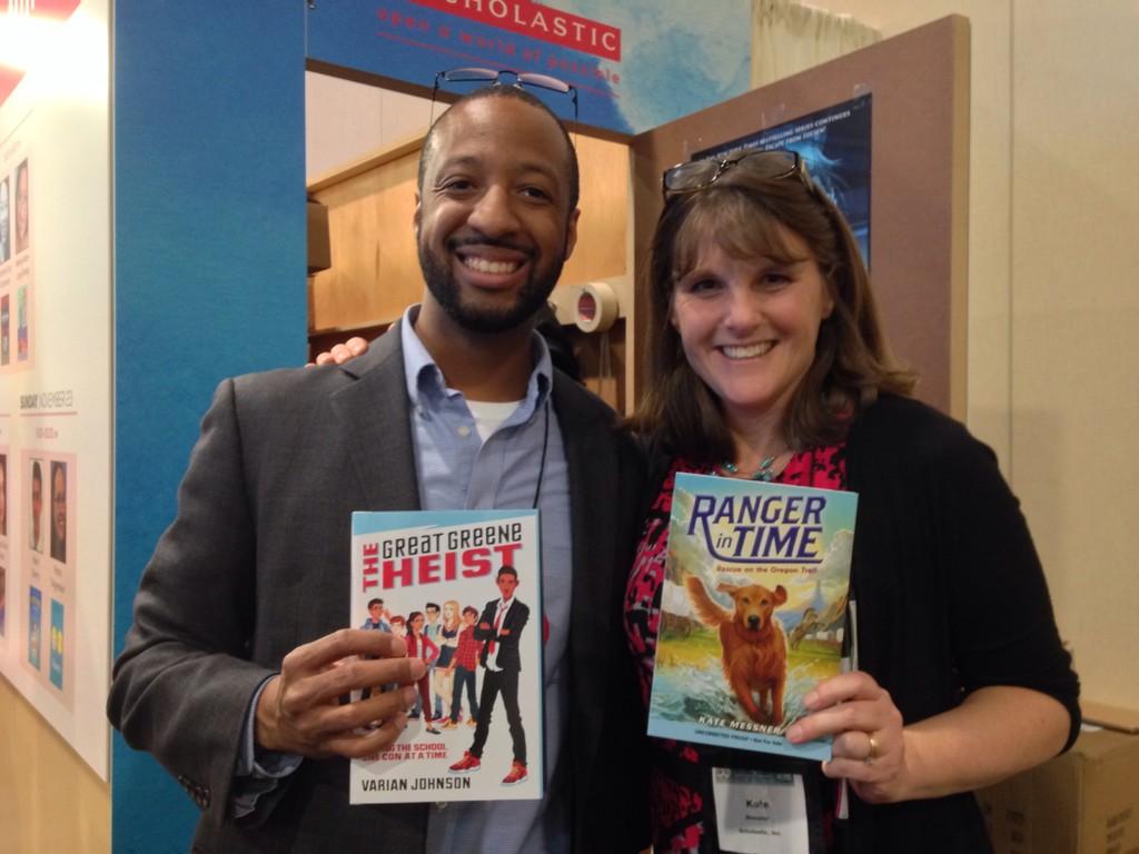
Here is the author of the book, Kate Messner, holding her copy:
I recently found out that Scholastic is also using Ranger on a reading poster for schools. Unleash the power of reading, get it? Unleash?
I recently found out that Scholastic is also using Ranger on a reading poster for schools. Unleash the power of reading, get it? Unleash?
Ranger in Time: Rescue on the Oregon Trail is already receiving great reviews. The book will be available online and in bookstores on January 6.
In addition to the cover, the book also contains 15 full-page black-and-white interior illustrations by yours truly, which you can read about in this post.
In addition to the cover, the book also contains 15 full-page black-and-white interior illustrations by yours truly, which you can read about in this post.


Why aren't you receiving royalties?? Was it just a flat fee for the illustrations?
ReplyDeleteYes, that's exactly why.
DeleteThey threw a moving target at you and you nailed it. Bullseye, Mr. Spock!
ReplyDeleteDog: "I'm gonna save that kid no matter what that stupid horse says!" Music Swells!!! go, Kelley!
ReplyDelete